Tag Archives: Design

CNET Redesign Coming, Unfortunately

Last Monday CNET announced on their Outside the Lines blog that a redesign is underway. Normally I enjoy seeing new designs released, but not this time. I’m a big fan of CNET’s current design. It’s got a great look, and it’s inspired elements of designs I’ve worked on before.

The new design, which they showed a few screenshots of, just looks…bad. It looks generic and not well-thought out. There’s less whitespace, and the navigation doesn’t look as usable. I don’t particularly enjoy critiscising other designers’ work, but this…just isn’t as good. It’s several steps backward.

See a preview of the new design here. Then compare it to the current version.

The announcement has several pages of comments consisting mainly of people pointing out why the don’t like the redesign, with a few people who do like it mixed in. Will the management pay attention though? I find it a little disturbing that the author of the post said

From some of the commenters it appears the paint job framing the content is more important than the content. Yellow, red, green, blue, black whatever. We came up the cleaner look and updated logo for presenting content. Beauty is only skin deep….

So Mr. Farber went from detailing why CNET “needs” a redesign, and why the design is important, to saying the design is irrelevant? Besides, the abundant comments aren’t just about the change of colors. The new design just doesn’t look as usable, nor as unique.

10 Design Roundups You Shouldn’t Have Missed

It seems that a new post showcasing a collection of interesting web designs surfaces every week or so, sometimes more often. Here are a few older ones that

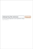
Book Review: Designing the Obvious

I recently came a across a mention online of Designing the Obvious by Robert Hoekman Jr. Being a cheapskate as usual, I checked the local library’s catalog for the book, and checked it out the next time I went there.

Designing the Obvious is a guide to designing highly usable web applications, featuring the idea that simplicity is the key to usability. It covers plenty of bases, and is very thorough with its advice and explanations. The book is easy to understand, and is a good read for anyone who develops web applications, or is involved in the design of any sort of website.

There are plenty of examples, in the form of diagrams screen shots from websites, to illustrate the points, and overall the book strikes me as being very blog-like. The writing style, the assortment of interesting pictures, and the way the type is set all remind me of a blog.

Being an advocate of simplicity in interface design, the author has included several examples from Apple and Google, of course, as well as 37Signals’ Backpack. I found his theory that instead of using a modal prompt when deleting data, you should instead delete it immediately and offer to undo it after (as seen in GMail), particularly enlightening.

Mr. Hoekman strikes me as being very knowledgeable in the area of web app design, and I found myself agreeing with a good portion of his points, and I think I learned a few things as I read the book. If you do a bit of web design, whether it’s related to web apps or not, I would recommend giving the book a try.

(Multi)Design Spotlight: Mozilla

With the launch of Firefox 3, Mozilla redesigned all of their sites (save for the Mozilla Foundation at Mozilla.org). As usual, their designs are clean and usable, and they have the signature “Mozilla Look” that they’ve had since the Firefox project took off. Let’s take a look at some of the new pages.

The New Navigation Bar

Mozilla’s site-wide navigation bar has changed a bit, though it retains the blue coloration. It’s smoother and more “plasticy,” and I think it’s a bit of an improvement, though I think it would look better if it had 100% width like its predecessor.

Mozilla Navigation Bar

Continue reading →

Design Spotlight: Darren Hoyt Dot Com

Web designer Darren Hoyt recently redesigned his blog Darren Hoyt Dot Com.

Darren Hoyt

Continue reading →

Design Spotlight: StylizedWeb

Today’s featured design is that of StylizedWeb.com.

StylizedWeb.com

Continue reading →

What the Mac OS Can Teach You About Design

The first thing most people think when they turn a Mac on for the first time is something along the lines of “Wow. This looks cool.” Then the next thing you notice, or more accurately, don’t notice, is the act of using the OS. Once you get used to how everything works, which doesn’t take long if you’ve used another OS (read: Windows) before, you don’t have to think about it. It’s intuitive enough that you just do what you need to do without having to think about it much. You don’t have to worry about the OS itself much either, except when you need to do some occasional maintenance.

The Mac OS is

  • Good-looking
  • Intuitive/Usable
  • Simple

Those three bullet points are some of the most important things to think about when it comes to web design. Obviously you want to have a good-looking design (don’t tell me you like GeoCities-style pages…). The other two points are very important. If you must have a horrible-looking design, the second two points are worth putting some thought into.

Simplicity doesn’t necessarily mean having a Google-esque design. You could classify Digg as a fairly simple design, though not to the point of Google. Ideally you want to simplify elements of your design, to make it more usable, but that doesn’t mean you have to not have any images or color.

Continue reading →

Web 2.0 How-To Design Style Guide

Web Design From Scratch has a great article that I’ve read a few times in the past, and recommend for anyone who does more than just edit prefab templates for their website. If you make actual designs from scratch (I’m not sure if that was a pun exactly, but it was accidental…), then you should read this.

Web 2.0 How-To Design Style Guide

Even if you’re not into the whole “Web 2.0″ thing, it’s still worth reading. The “Web 2.0″ style of design is more than just gradients and shiny stuff. The important parts can go into any design, and are often good practices. Such concepts include

  • Simplicity
  • Big text
  • Strong colors
  • Simplicity
  • Strong logos
  • Simple, easy to use navigation
  • Simplicity

If you want to make effective and usable designs, the article definitely worth a look.

32 Lightweight Designs

Once again, I’ve been skimming through the design galleries and looking through notes and bookmarks in search of noteworthy designs. This time around, I’ve put together a collection of light designs. While more graphic-heavy designs may look great, simplicity and whitespace can go a long way as well.

Without further ado, 32 Lightweight Designs:

31Three

Continue reading →

Elements of Design

Most design galleries showcase interesting/well-designed/etc web designs. Elements of Design is not like them. Brought to you by the Smiley Cat Web Design Blog, Elements of Design focuses on individual elements of designs.

Some examples include:

  • Search boxes
  • Comments and Comment Forms
  • Pull Quotes
  • Pricing Tables
  • Headline Typography

It’s an interesting idea, and a welcome source for inspiration. I’ve often wished there was a place to find inspiration when working on a small part of a larger design. I think I will find this useful in the future, provided I can remember the site’s name, as I tend to forget when I most need a site… :D

If you do much design, or if you just appreciate good design, the site is worth a look.